
Editing for creators: how to standardize photos with a strong visual aesthetic.
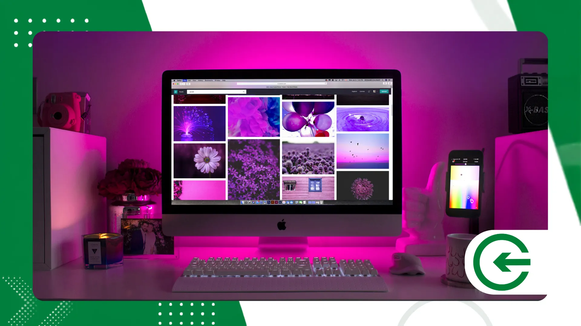
A Creator edition It is the ultimate tool for those seeking to build a strong, coherent, and recognizable brand identity in the digital ecosystem.
ADVERTISING
Maintaining aesthetic consistency in saturated feeds requires technique, visual consistency, and a structured workflow to optimize production time.
Learn how to apply professional concepts of lighting, color, and image processing to transform simple shots into a truly memorable portfolio.
Summary
- What is image standardization and why does it matter?
- How do you define a consistent color palette for your photos?
- What tools optimize editing for creators in their daily work?
- How do you align the lighting between photos of different environments?
- Comparative table of professional color profiles and formats.
- What is the role of presets in a professional workflow?
- Conclusion
- Frequently Asked Questions (FAQ)
What is image standardization and why does it matter?
Building a strong digital presence requires more than just posting pretty pictures in isolation on your social media or online portfolios.
Visual identity functions as a professional's signature, allowing the audience to instantly identify the content during daily browsing.
advertising
When the feed features abrupt variations in tone, saturation, and contrast, the perception of professionalism drops significantly among the target audience.
Developing your own style reduces the time spent on post-production, making the creative process much more agile and predictable in everyday life.
The psychology of color demonstrates that specific shades evoke distinct emotions, connecting the brand directly to the feelings of its viewer.
Established brands use aesthetic consistency to generate retention, authority, and immediate trust in today's highly competitive market.
Mastering advanced editing techniques ensures that productions made in diverse settings maintain the same visual atmosphere without appearing repetitive.
How do you define a consistent color palette for your photos?
Select three dominant tones to guide all your visual compositions and image edits from today onwards.
Working with analogous colors creates a sense of soft harmony, while complementary colors bring high impact and dynamism to the reader's eye.
Adjusting the HSL (Hue, Saturation, and Luminance) tool allows you to isolate and modify specific tones without altering the skin of the subjects being photographed.
Avoid oversaturating the environment, prioritizing neutral tones in the backgrounds to elegantly highlight the main element of the photograph.
Analyzing the color wheel helps to understand how shadows and lights interact when we apply partial tone changes in the chosen software.
Testing different combinations on a reference board makes it easier to choose the ideal palette before starting the actual photo sessions.
The constant pursuit of tonal harmony distinguishes amateur creators from established professionals who have mastered the art. Creator edition modern.
Understanding color theory is fundamental for making informed decisions during the capture and final processing of each digital file.
What tools optimize editing for creators in their daily work?
Software from the Adobe Lightroom and Photoshop lines continue to be the industry standards for advanced image processing and color control.
The use of Adobe Lightroom Cloud Ensures seamless synchronization of files and settings between mobile devices and desktop computers.
Modern platforms incorporate artificial intelligence features that automate complex subject, background, and sky masking in just a few seconds.
High-precision mobile applications offer complete tone curves and color profile management right in the palm of your hand every day.
Automating repetitive tasks frees up professionals to focus on the artistic aspects of the project, optimizing deadlines and reducing stress.
Organizing files into catalogs structured by dates and tags prevents the loss of important materials during large-scale visual projects.
Choosing the right application depends directly on your workload and the complexity of the manipulations required in each project.
How do you align the lighting between photos of different environments?
White balance is the first parameter to adjust when seeking uniformity between images captured in completely different locations.
Photos taken under warm natural light require corrections to the blue channels to match those taken under cool or artificial lighting.
Adjusting the luminance curves balances the exposure points, ensuring that whites and blacks maintain identical densities in the gallery.
Using the histogram as a visual guide prevents important details from being lost in deep shadows or blown-out highlights.
Inserting a neutral gray card on the first click of the session serves as an exact reference for calibrating the editing software later.
Harmonizing the intensity of shadows softens the visual transition between photos taken on sunny days and those covered by dense clouds.
Correcting the native vignetting of photographic lenses standardizes the frame edges, keeping attention focused on the main subject of the scene.
++ Lighting tricks that instantly improve your photos.
Comparative table of professional color profiles and formats.
Choosing the right capture file and color space is the foundation for ensuring visual fidelity across different screens and prints.
| Format / Profile | Dynamic Range | Editing Flexibility | Recommended Use in Flow |
| RAW (DNG/CR3) | Maximum (12 to 14 bits) | Extremely high without loss. | Basic recording and editing |
| JPEG | Limited (8 bits) | Low (generates artifacts) | Final export for web |
| sRGB | Standard for screens | Average | Publishing on social networks |
| Display P3 | Wide range of colors | High | Modern devices |
Working with uncompressed files ensures that the Creator edition Achieve the highest level of detail and color fidelity.
The final conversion to the sRGB profile prevents unwanted color variations when your images are viewed on generic smartphone screens.
++ Food photo editing to highlight dishes and drinks.
How to develop a critical eye during photography?

True aesthetic consistency begins the moment you frame the scene through the lens of your camera or smartphone.
Thinking about the editing even before pressing the shutter button saves hours of hard work in the post-production stage.
Pay attention to the direction of natural light and avoid unwanted background elements that could clutter the visual composition of your project.
Maintaining the same angle height in similar photo series helps create a visually pleasing spatial pattern.
Train your perception to identify shadow contrasts that require manual compensation during everyday photo shoots.
What common mistakes ruin the harmony of your feed?
Excessive artificial sharpening creates unpleasant noise that detracts from the professional look of any digital image.
Drastically changing the color temperature between consecutive photos breaks the visual rhythm and disorients the visitor's navigation.
Oversaturating the primary colors makes the final result look artificial and drastically reduces the elegance of your design.
Sending files with excessive compression to the platforms compromises the subtlest details obtained during the processing stage.
Ignoring the cropping and alignment of the horizon conveys a technical carelessness that affects the credibility of your work.
How do I organize the visual grid before publishing?
Digital planners allow you to preview how new images will interact with posts that are already live.
Alternating wide shots with close-up shots creates an aesthetic break that is crucial for the scannability of the complete profile.
Distributing the dominant color dots alternately prevents concentrating the weight on only one side of the screen.
Testing different posting sequences ensures that each new piece of content adds value to the overall message without creating clutter.
Analyzing the overall harmony before final submission prevents last-minute edits and unnecessary rework in your workflow.
What is the role of presets in a professional workflow?
Presets are saved settings that serve as a quick starting point for standardizing large volumes of digital photos.
Creating your own custom filters ensures that your visual style remains unique and difficult for the competition to copy.
Applying a generic preset without making small, fine adjustments to exposure and white balance can ruin the final result.
Adjusting the intensity of the applied preset allows you to tailor the effect to the specific lighting of each imported file.
Developing seasonal adjustment packages helps maintain an up-to-date aesthetic without losing the essence of your brand on social media.
The consistency achieved through authoring templates consolidates the Creator edition as a fundamental market positioning strategy.
Studying how skin tone behaves under different filters avoids unpleasant distortions that affect the realism of the final photograph.
++ Cinematic filters in VSCO for travel photos
Conclusion
Building a strong visual aesthetic requires dedication, continuous study of the tools, and a critical eye on one's own artistic production.
Standardizing your photos shouldn't limit your creativity, but rather serve as a solid framework for expressing your unique vision.
Adopting an organized workflow transforms your posting routine, generating professional results that set your profile apart from the majority.
With the right color processing and management techniques, your images will reach a new level of impact and real engagement.
Deepen your knowledge by consulting technical guidelines on photography and digital manipulation on the portal of National Geographic Photography Guide, one of the biggest global references in the sector.
Start applying these concepts today and watch your visual identity solidify with authority and elegance in the market.
Frequently Asked Questions (FAQ)
What does it mean to standardize the aesthetics of a feed?
It means applying guidelines for color, light, contrast, and composition so that all the photos appear to belong to the same harmonious whole.
Can I standardize photos taken with my cell phone and camera?
Yes, using advanced editing software that allows you to align the color temperature, sharpness, and skin tone of both sources.
Do pre-set presets work on all types of photos?
No, they serve as a base and always require manual adjustments to exposure and white balance to adapt to the image's lighting.
What's the best color profile for posting photos online?
The sRGB profile is the universal standard for browsers and social networks, ensuring that colors do not change on different screens.
How long does it take to create your own visual style?
It's an ongoing testing process that usually solidifies after a few weeks of consistent practice and portfolio analysis.
